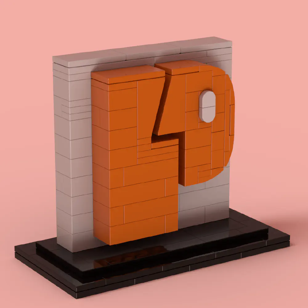
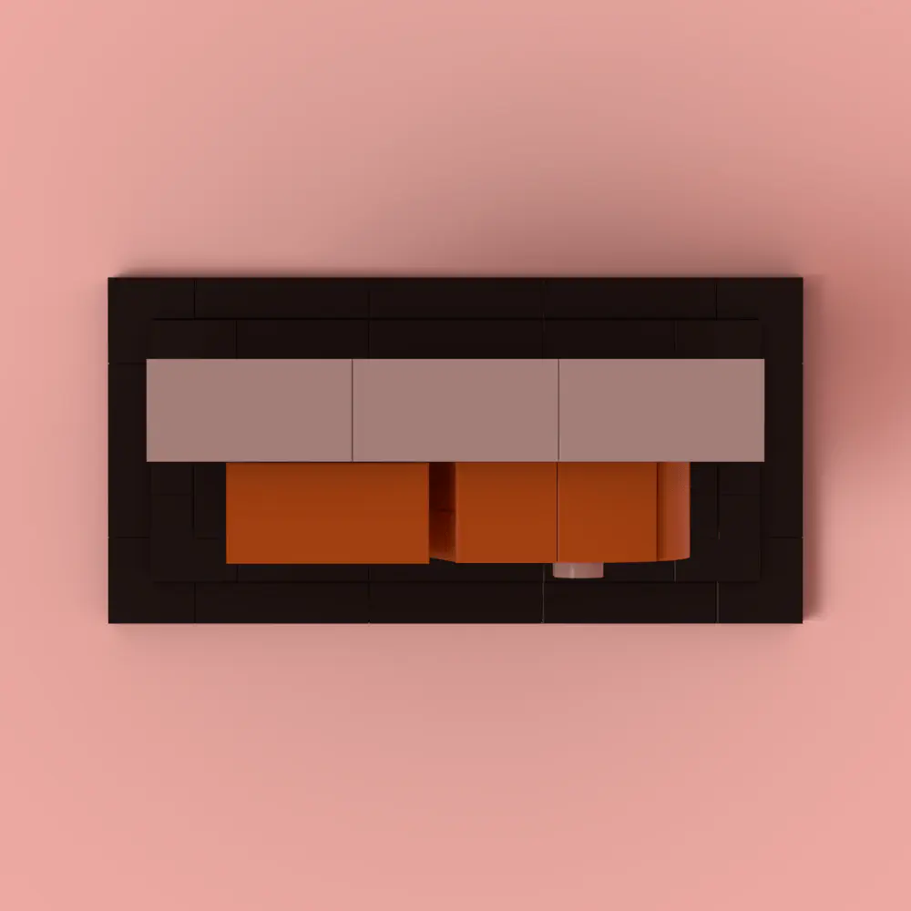
People for People (P4P) community logo, from People to Lego and Lego to People!.


My work is available for free, but if you'd like to support me,
you can buy the instructions on Rebrickable of one of my fun Beer or Coffee models.
Your support helps me continue creating new designs!
Description
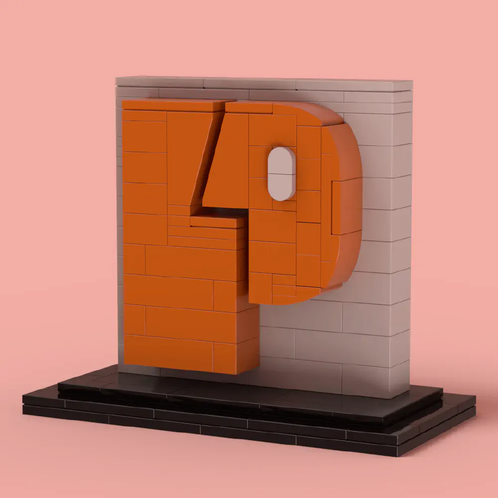
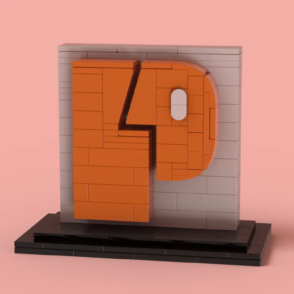
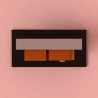
It all started when I, surrounded by an amazing group of people I work with and consider friends, stumbled upon the P4P logo. The challenge struck me – could I translate its essence into LEGO bricks? Well, I took the plunge.
Breaking down the logo, I carefully crafted the iconic ‘P’, the watchful eye, and the intricate ‘4’ nestled within the ‘P’. Scaling was a bit tricky, especially with that ‘4,’ but once I found the right bricks, things just clicked into place (pun totally intended).
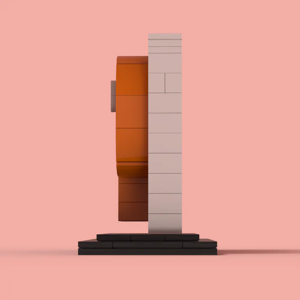
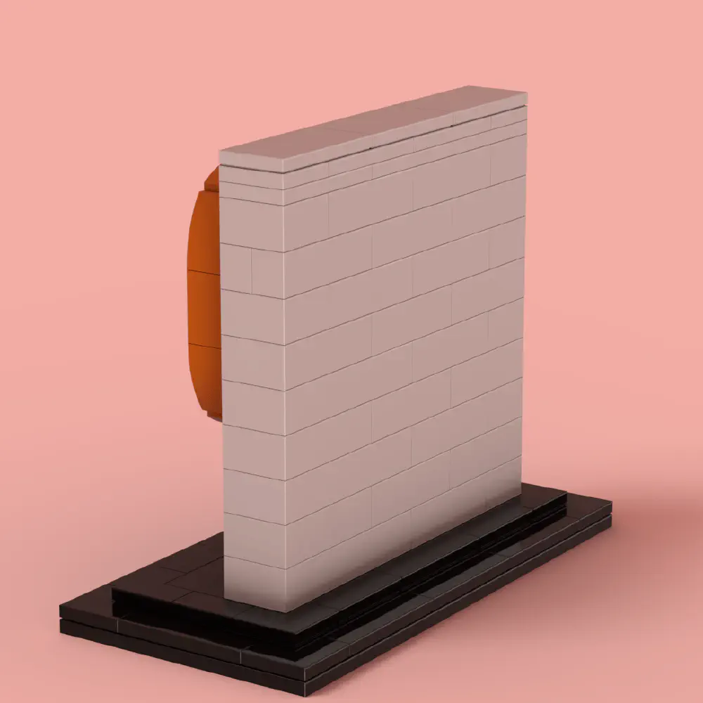
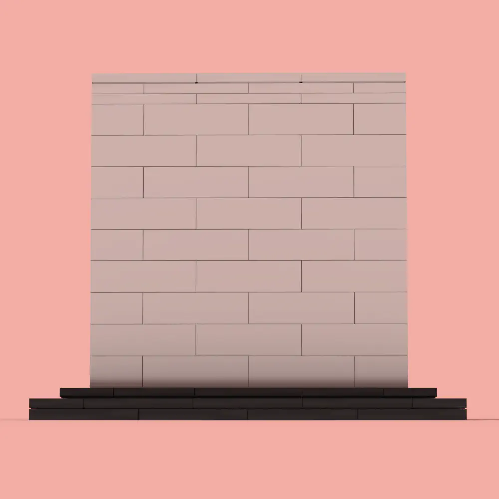
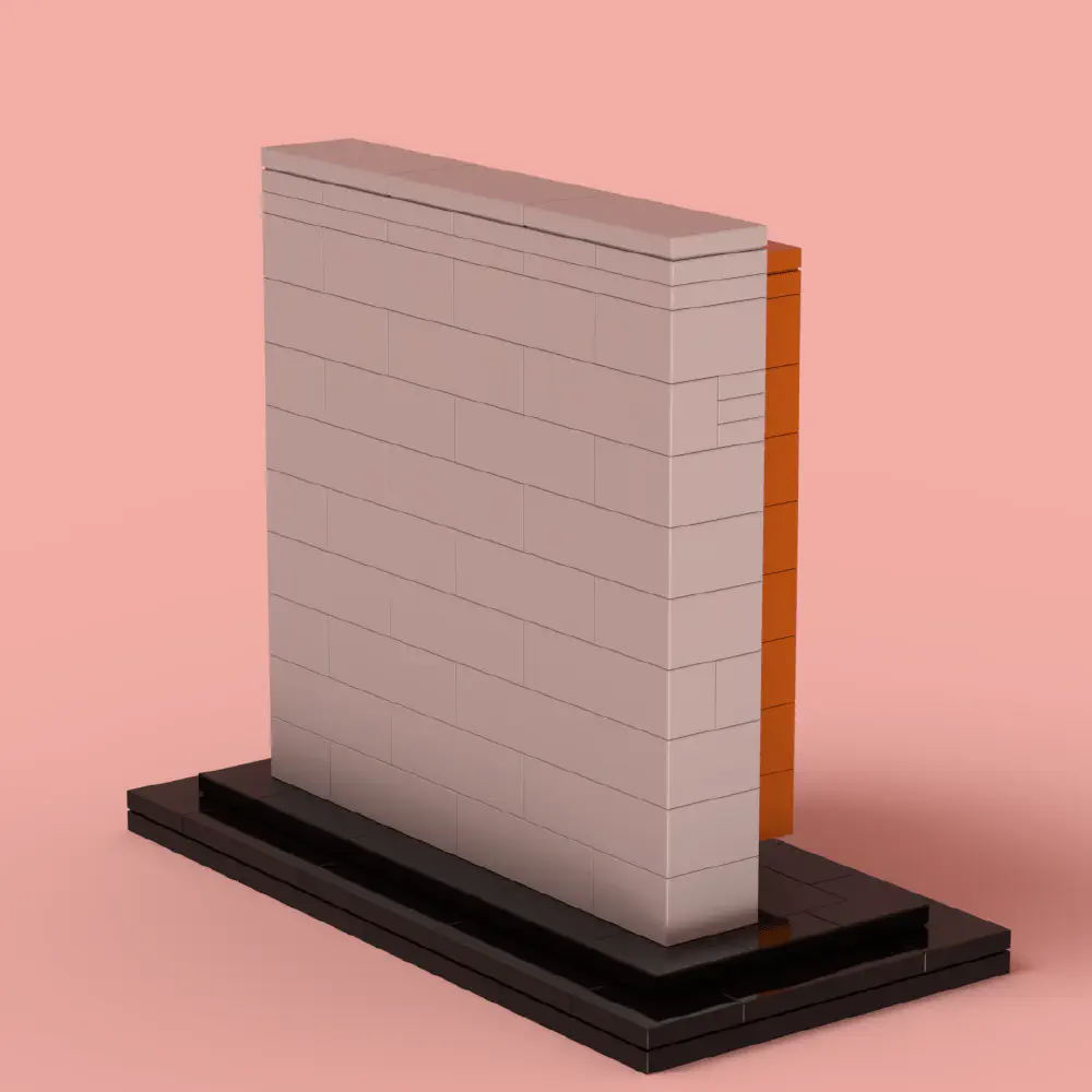
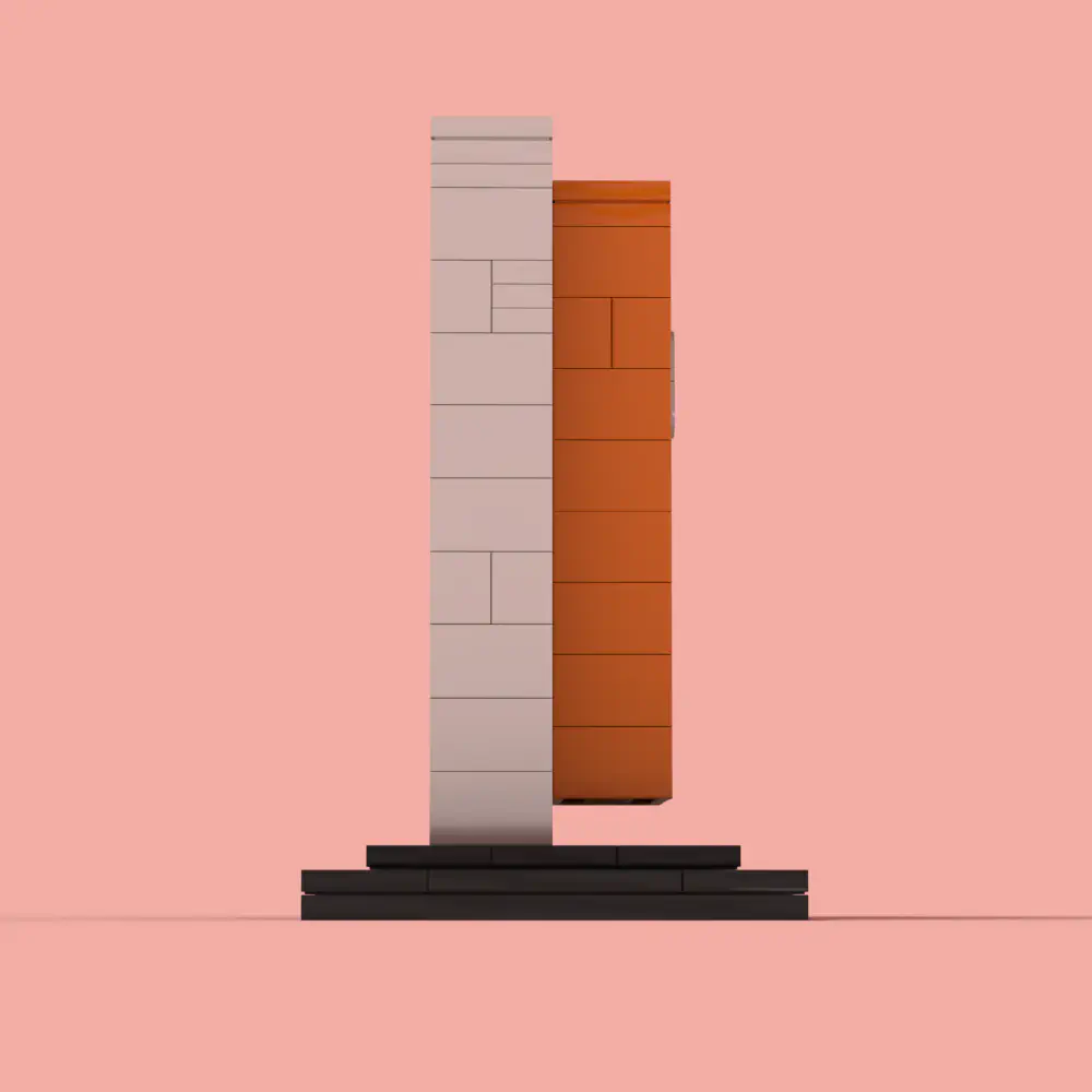
The building process involved some familiar techniques from my previous projects, like the FEUP logo and the BDN. Utilizing Technic Bricks and Pins, I created a sturdy foundation, mimicking the colors of the original logo as closely as possible.
Why LEGO?
LEGO has this magical ability to bring people together – whether it’s to marvel at a model or collaborate on assembling one. It aligns with the way we manage people, doesn’t it?
My Favorite Part
Definitely the ‘4’ inside the ‘P’. It was a challenge, but oh, the satisfaction when it came together!
Build Details
- Model designed by: Eduardo Sousa
- Total parts: 163
- Colors: The build features a striking orange for the main logo, contrasting beautifully against a light gray background. The black base adds an elegant touch, while the small white highlight in the ‘P’ enhances the design.
- Created using: LPub3D; LeoCAD
This post is now ready for publication in Hugo format! Let me know if you’d like any final tweaks. 🚀