The Bright Group logo reimagined in Bright bricks for Brigh People!


My work is available for free, but if you'd like to support me,
you can buy the instructions on Rebrickable of one of my fun Beer or Coffee models.
Your support helps me continue creating new designs!
Description
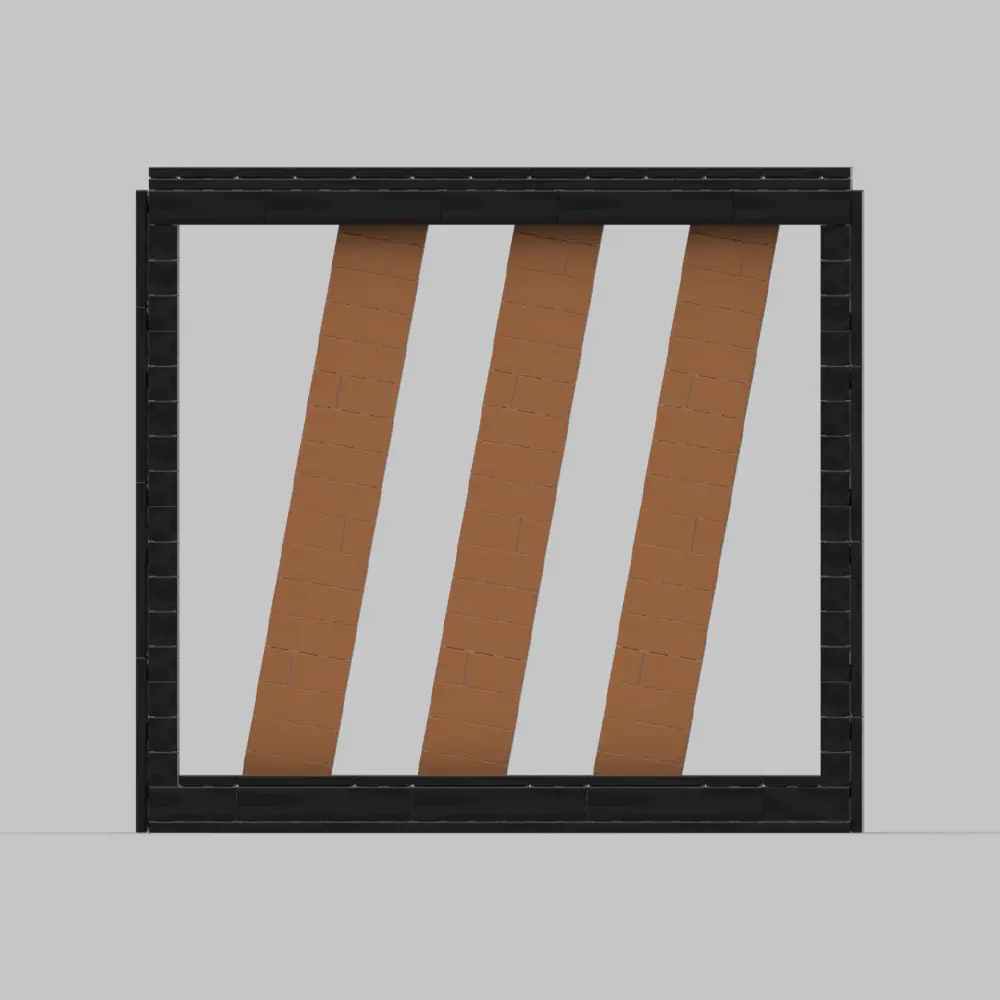
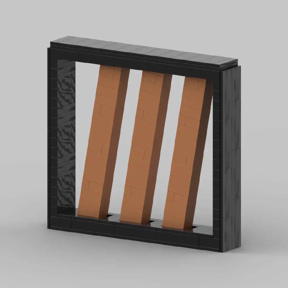
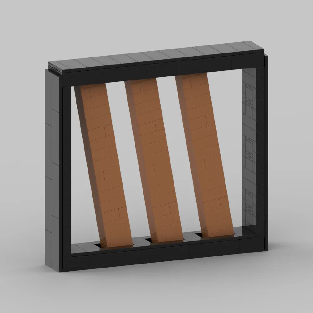
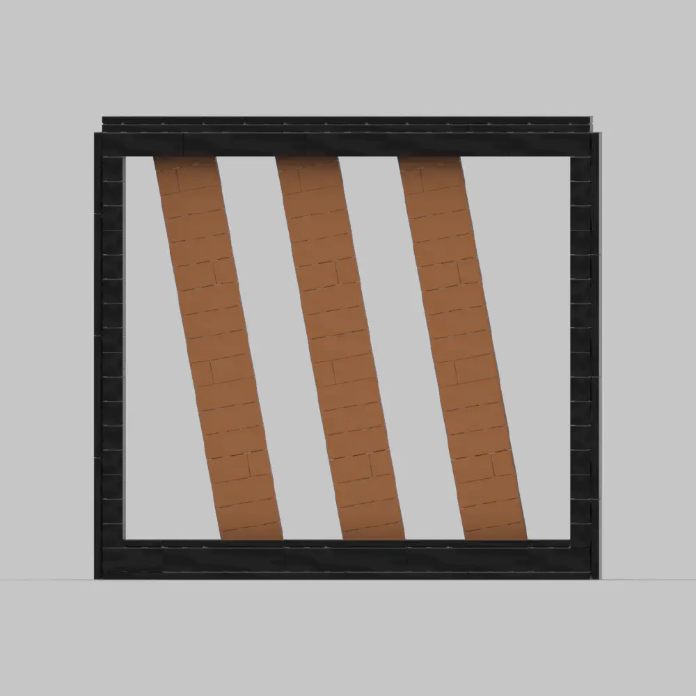
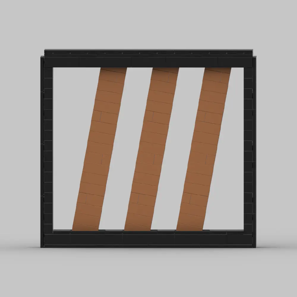
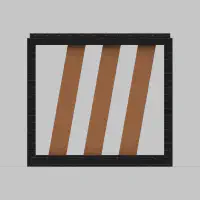
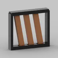
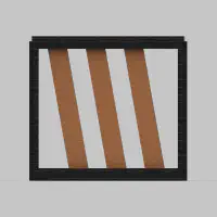
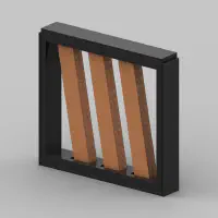
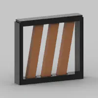
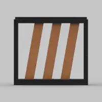
This MOC is a tribute to the identity and simplicity of the Bright Group brand. I work at Bright Factory, part of Bright Group, and this build represents more than just a logo, it’s a symbol of the creativity and innovation I get to be part of every day.
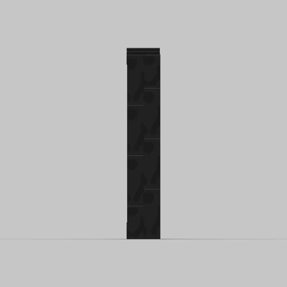
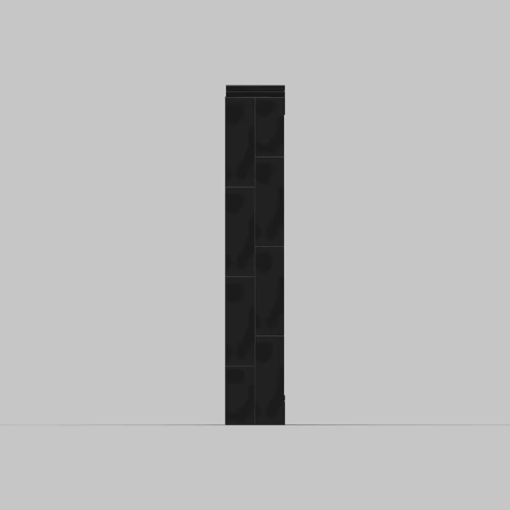
I focused on the most iconic feature: the three slanted bars that form the “I” in BrIght. Framed in a clean black border, they stand strong on their own, echoing the values the brand represents. The trickiest part was locking the angle. With clever hinge placement and a few half-hidden bricks, the bars are perfectly tilted, sturdy, and display ready like shipping a software feature with the simplest, most reliable solution.
Perfect for fellow Bright Pals to build and show off, on a desk, a shelf, or in the office hallway. Grab your bricks. Tilt those bars. Build Bright.
Build Details
- Model designed by: Eduardo Sousa
- Total parts: 286:contentReference[oaicite:0]{index=0}
- Colors: Bold black frame, three warm earth-tone bars (medium-nougat look) set into a neutral base—minimal palette for maximum brand impact
- Created using: LPub3D; LeoCAD